Angela Meyers

Michelle was recommended to me by an author friend, and I am so grateful! She was wonderful to work with. I had a deadline, and she found a chunk of time that worked for both of us. She was professional, incredibly efficient and amazing to work with. I loved the working relationship she developed between us and was awed by the speed with which our emails flew back and forth as she kept me in the loop and part of the process. She was very responsive, and willing to listen to my concerns and teach me. Because of Michelle, my book was printed and ready for the conference I was speaking at. I highly recommend Michelle!
Angela Meyers is a national speaker, family life educator and trainer, and has a bachelor’s degree in psychology and a master’s degree in family life education. This is her first book.
Project Overview
When Angela contacted me, she had a seminar scheduled eight weeks out and needed paperback copies of her nonfiction book delivered beforehand. I began copyediting even as she finished writing the final chapter. Once she completed revisions, I formatted the manuscript for both digital and paperback distribution, coached her on composing a back-cover blurb, helped her choose content for her front and back matter, and proofread her sales page copy and promo materials. In addition, the manuscript contained approximately fifty images that needed formatting. As she had no prior experience, she also needed guidance on the entire publication process. Happily, Angela had copies of her book in hand by the date of her speaking engagement.
My Work
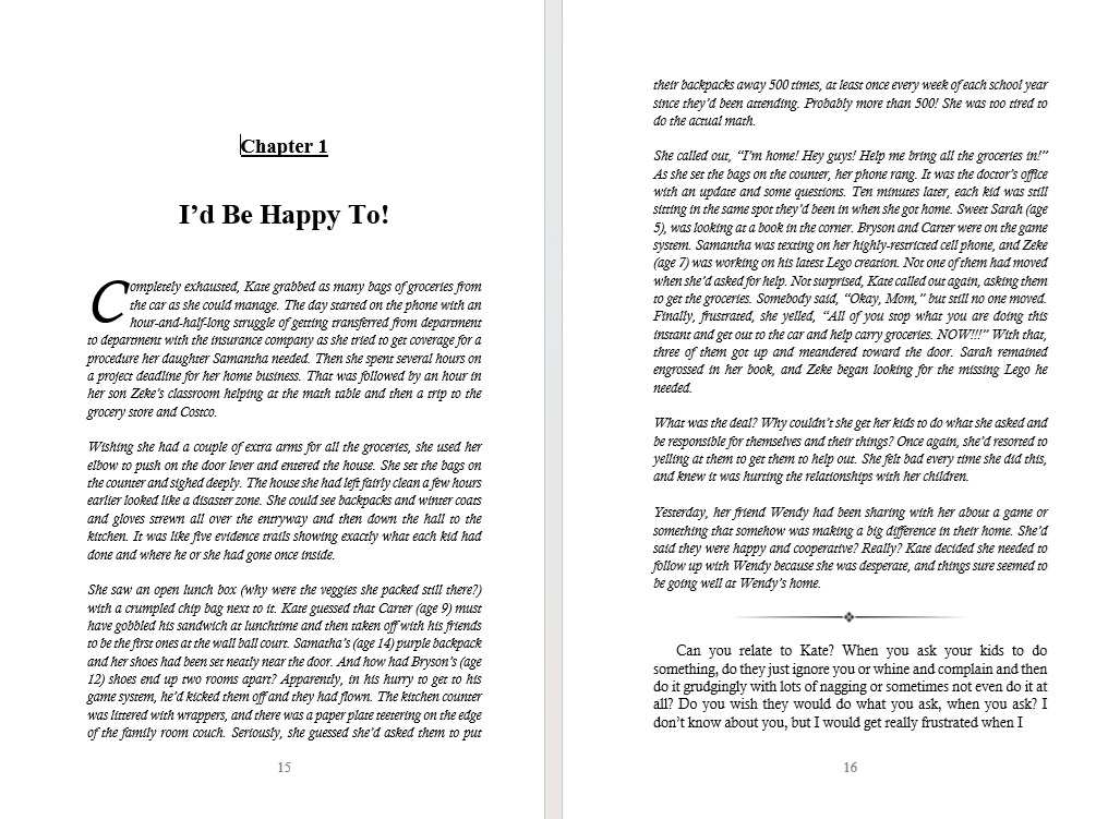
This is an email I wrote to Angela while I was formatting the digital version of her manuscript. It illustrates my communication style and some of the guidance I gave her on the process. Sample pages from the final formatted paperback will follow.
I’m seeing lots of questions, and I have a few of my own. I’ll address both below. Once formatting is finished, I’ll send the manuscript back to you to look over. Remember, this is the digital formatting version. The paperback will look a lot different. I’ll get to that last, after editing, so I only have to edit one document, then save it as a new document and finish paper formats there.
- I won’t put a cover image inside either the digital or paperback format. Amazon will add that in to the digital version. And the paperback will need a full front-and-back cover.
- I’d skip your tagline on the title page. It makes it look too cluttery, especially with the series name below. Save it for your back cover, your sales page, and your promo materials. Yes, I would put the series name and logo on the bottom of the title page.
- Interior fonts—for digital, the font doesn’t matter. Kindle users have the ability to change the font to whatever they like to read in. For paperback, I usually use Calisto MT for the main text. It looks a lot nicer than Times New Roman on paper. I will add different fonts for your chapter titles in paper. I try to tie in the appearance of the cover image fonts. More on that when we get to paper.
- Your copyright page is more complicated than it needs to be. It is not necessary to credit cover designer, interior designer, illustrator, etc. if any of those were you. If they were not you, it is a nice gesture, but still not required except the illustrator and maybe the cover designer—and in this case, the cartoonist. Are there actual illustrations you need to credit separately? You don’t need bisac categories here. Save those for the platforms you offer it on where people will actually use them to look it up. ISBNs need to be different for every format of your book. I see you already have one. We can use it on the paperback. We don’t need it for the digital version. Amazon will assign one. (They would have assigned one for the paperback too.) You don’t need a Library of Congress control number, though if you want one, I’ll add it in. I’m going to simplify the page a bit. We can always add something back in if you want.
- There will be little to no spacing at the top of each page in the digital version because it doesn’t show up well on a small screen. No room. It ends up looking like a blank page as it scrolls. So the pages will look squashed toward the top on a computer, but it will read better on a Kindle/Tablet.
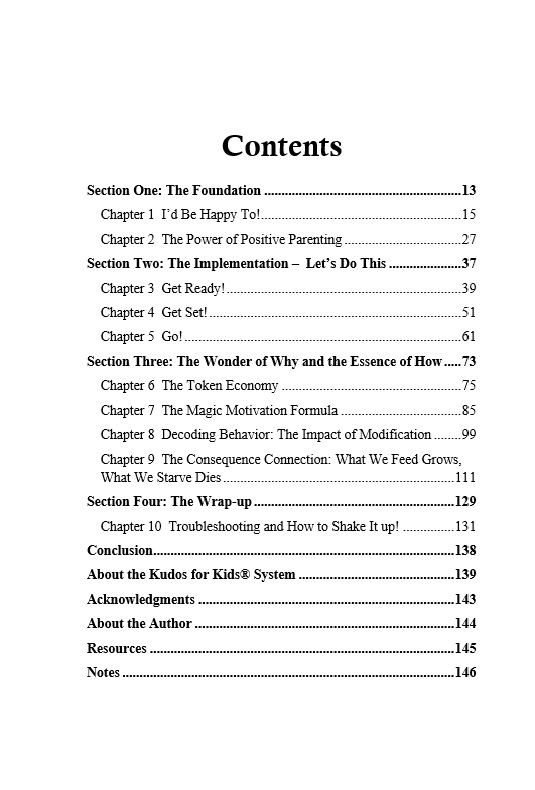
- I’m going to design the automated Kindle TOC (table of contents) to look like the one you designed. If you want anything else, like the preface or whatever, to show up in the TOC, let me know.
- Also, in your TOC you show sections 1-4 with chapters beneath them, but I don’t see those divisions within the text. Do you want them in the text? If so, how would you like them designated, with a separate page denoting the beginning of each? Or as a separate, larger title above the first chapter title listed that section?